My job for the next week is to examine other stylistic choices for the crossing, including fonts.
Background

Patterns


Mock Ups
Triangular mockup


Rectangle


We decided to move forward with the rectangular design, just because it already fits into the language of a zebra crossing (rectangular) rather than the triangular one which could become confusing as it is less familiar.
Other Styles We Could Look At
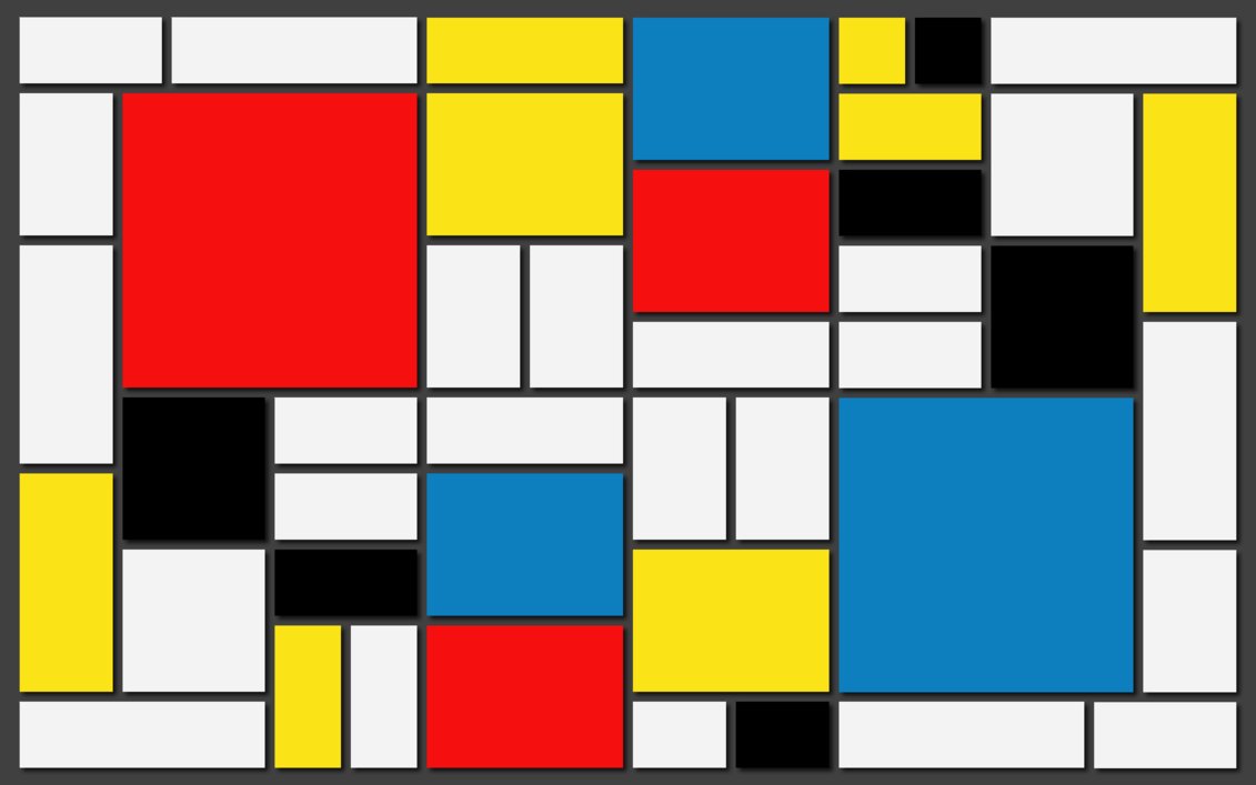
Thomas mentioned that our design looked quite like Mondrian... look at famous Wellington artists also?
Keith Haring


Mondrian
Thomas mentioned that our design looked quite like Mondrian... look at famous Wellington artists also?
Keith Haring

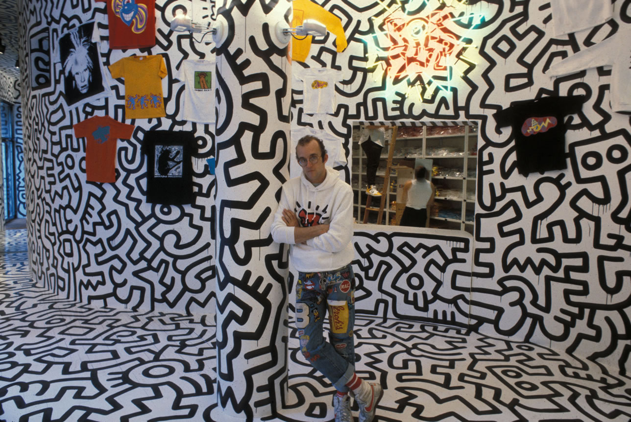
Very chunky art, good in a spatial/outdoor setting because of how bold, colourful and outlined it is.
Mondrian
No comments:
Post a Comment